Broadway Fashion Heuristic Evaluation
An evaluation of the current website of Broadway Fashion and identifying what violations are present and how they can be remedied.
This project was done alongside Cole Boyce, Collin Lo, and Thy Nguyen
Project Length: 2-weeks
Software used: Figma, InVision, Photoshop
The Problem
Problem Statement
The goal of this project was to conduct a heuristic evaluation using Nielsen’s 10 principles for user interface design.
These are the 10 principles, which are accompanied by a severity rating scale based on how detrimental the problem is in relation to the heuristic.
1. Visibility of System Status
2. Match between System and
the Real World
3. User Control and Freedom
4. Consistency and Standards
5. Error Prevention
6. Recognition rather than recall
7. Flexibility and Efficiency of Use
8. Aesthetic and Minimalist Design
9. Help users recognize, diagnose, and recover from errors
10. Help and Documentation
Severity Rating Scale

The Heuristic Evaluation
For this, we looked at Broadway Fashion, a staple fashion store in Toronto that has a solid social media presence thus they need to be looking to optimize their website and reduce any possible heuristic violations.

We looked through the website to check what aspects were violating any of the 10 heuristic principles and found 5 of the most severe issues that violated 5 different heuristics.
Violation #1 - Consistency and Standards (#4)
Problem: Sold-out items are still shown when browsing store products.

Recommendation: Completely remove the sold-out items from the product list.

Advantages
-
Users are no longer confused when wanting to view an item
-
Users can only see items that are available
Violation #2 - User Control and Freedom (#3)
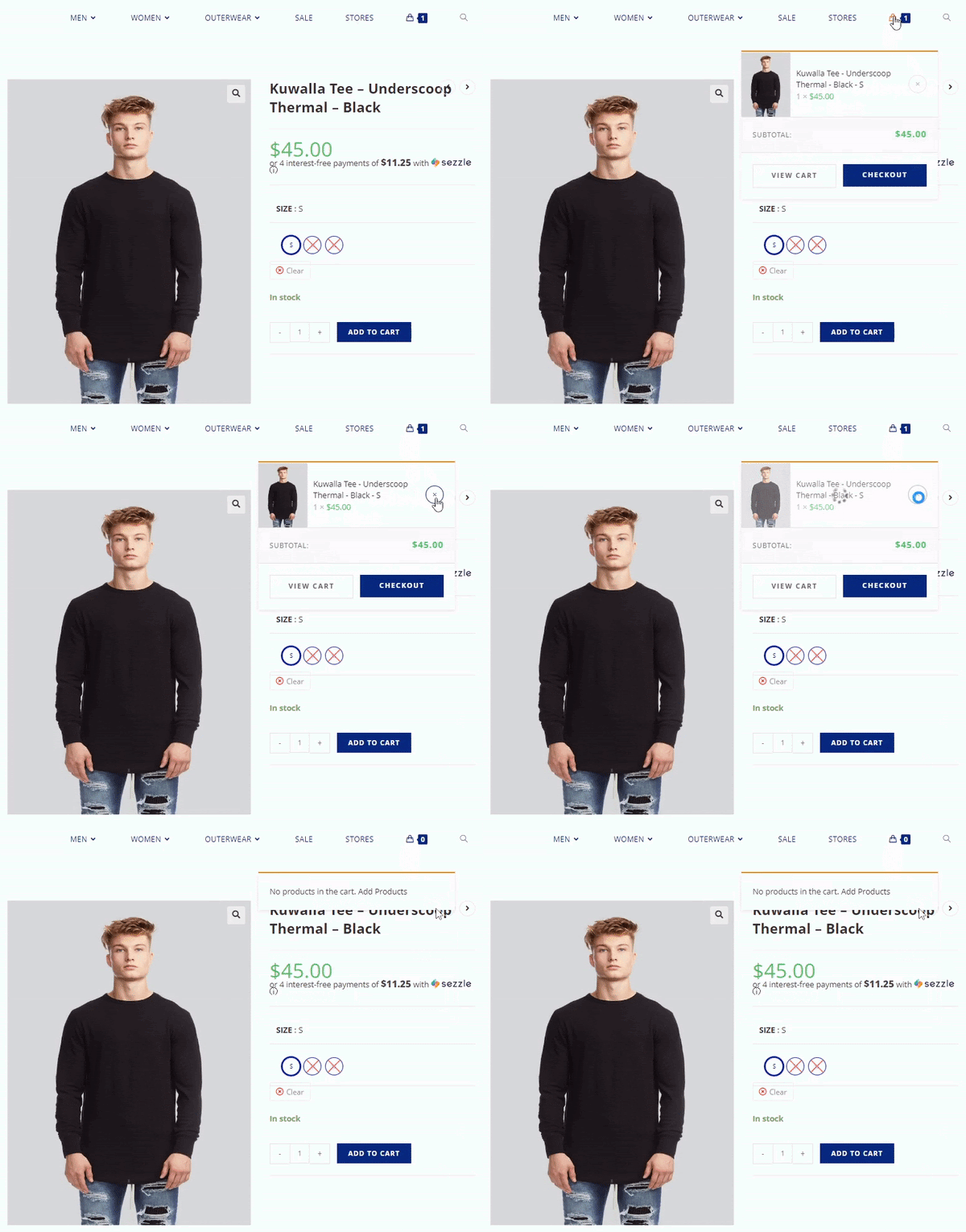
Problem: There is no option to recover an item that was mistakenly removed from the cart.

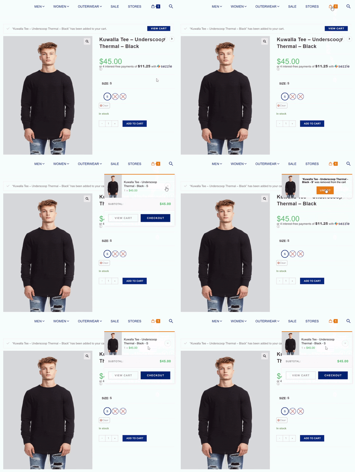
Recommendation: Include an Undo button to give the user the option to recover the item.

Advantages
-
Allow users to re-add items to their cart after initially deleting them
-
Give users the option to quickly recover from possible misclicks
-
Give users the option to change their minds about a purchase decision
Violation #3 - Help Users Recognize, Diagnose And Recover From Errors (#9)
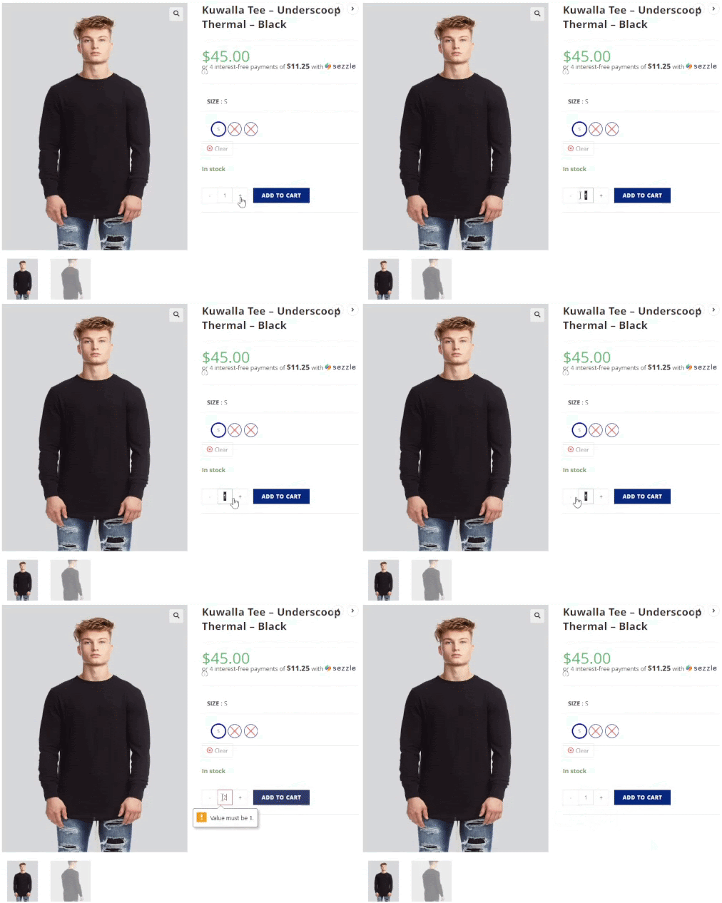
Problem: Stepper function doesn't work based on stock limits.

Recommendation: An error message stating that you are unable to add an item due to its low stock.

Advantages
-
Addition of error message
-
Users are informed on why the stepper doesn’t work
Violation #4 - Aesthetic and Minimalist Design (#8)
Problem: Unnecessary addition of Women’s brands in the Men’s section.

Recommendation: Completely remove Women’s Brands on the left side and only have Men’s Brands present.

Advantages
-
Removed women’s brand menu
-
User will no longer be potentially distracted by irrelevant info
-
User can focus on relevant content within that page
Violation #5 - Visibility of System Status (#1)
Problem: No clear indication of where the user is at during the checking out process.

Recommendation: Add a progress bar that informs users on where they are during the checkout process.

Advantages
-
Informative progress bar
-
Helps users navigate their location
Below is the link to the prototype of the website with the updated heuristic changes
Check it out on Figma!
Key Learnings
Work within established design constraints of typography and colour
- changes should mirror the existing design of a brand to stay in line with their vision
- helps the designer understand how to design based on given constraints
Build consistency and system standards
- designer should always strive to maintain the standards they set for themselves and have that reflected in their work
Prioritize heuristic evaluations and apply design solutions
- heuristics help strengthen a designer’s understanding of the ease of navigation products need to be in order to be functional.
